Project
Esalen Rebrand/Website Update
Esalen Rebrand/Website Update
Background
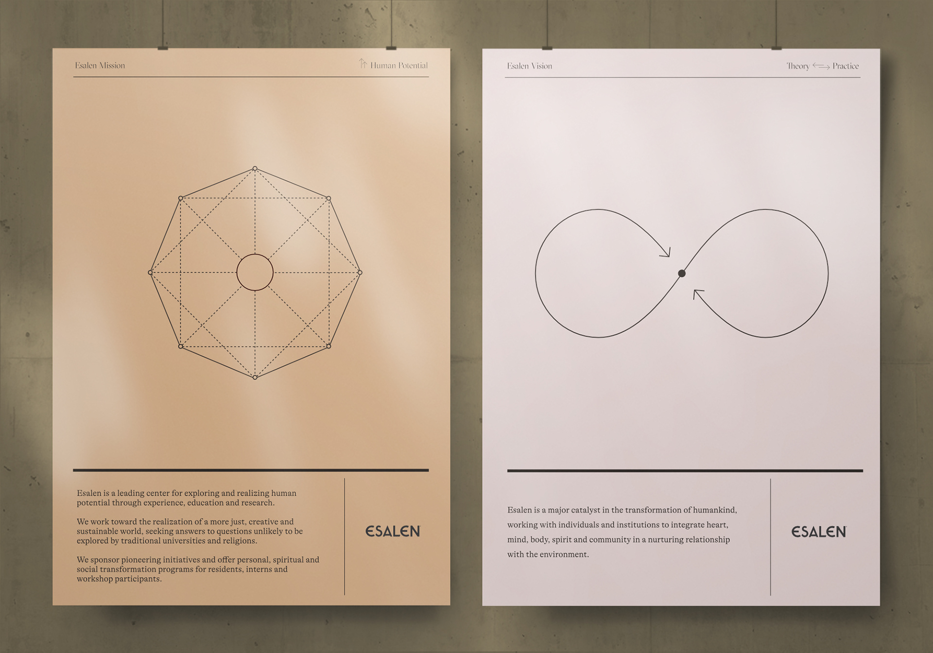
Esalen is a major catalyst in the transformation of humankind, working with individuals and institutions to integrate body, mind, heart, spirit, and community in a nurturing relationship with the environment. In 2020, we developed a strategy to clarify the company’s goals throughout its web presence and reshape the visual identity to connect it to its origins that began in the 60s.
Esalen is a major catalyst in the transformation of humankind, working with individuals and institutions to integrate body, mind, heart, spirit, and community in a nurturing relationship with the environment. In 2020, we developed a strategy to clarify the company’s goals throughout its web presence and reshape the visual identity to connect it to its origins that began in the 60s.
Concept
Return the Esalen brand to its roots and clarify its positioning as a leader for exploring and realizing human potential through experience, education, and research.
Return the Esalen brand to its roots and clarify its positioning as a leader for exploring and realizing human potential through experience, education, and research.
Role
Design Lead
Research, Brand strategy, creative direction, product design
Design Lead
Research, Brand strategy, creative direction, product design
Additional Team
Director of Marketing: Michelle Broderick
Development: John D. Saunders @ 5Four Digital
Copywriting: Sara Cardace Timeline: 4 months
Director of Marketing: Michelle Broderick
Development: John D. Saunders @ 5Four Digital
Copywriting: Sara Cardace Timeline: 4 months
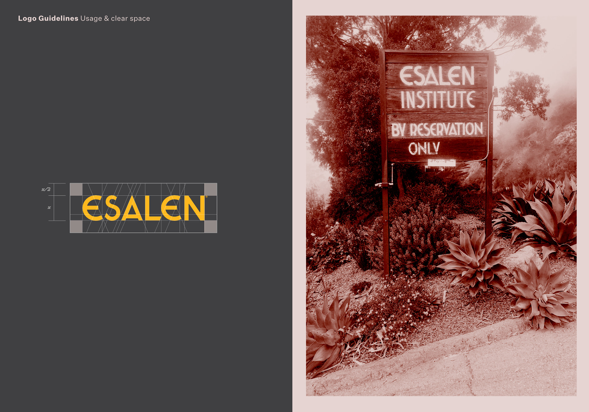
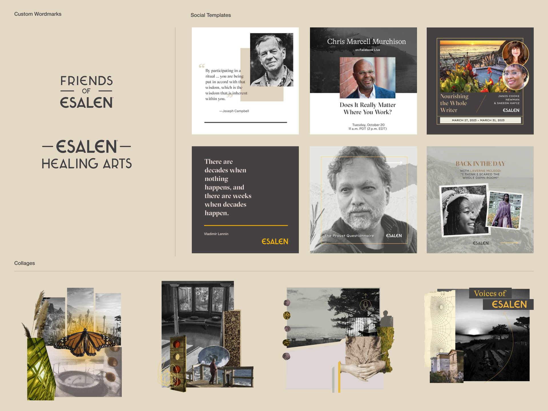
The Esalen logo was taken from the original sign at the entrance to the grounds. I took the letterforms from the original sign and balanced all the letters as well as constructing all the angles so that they were uniform. Lots of small details to update to create dynamic and energetic sharp diagonals in this brand identity.
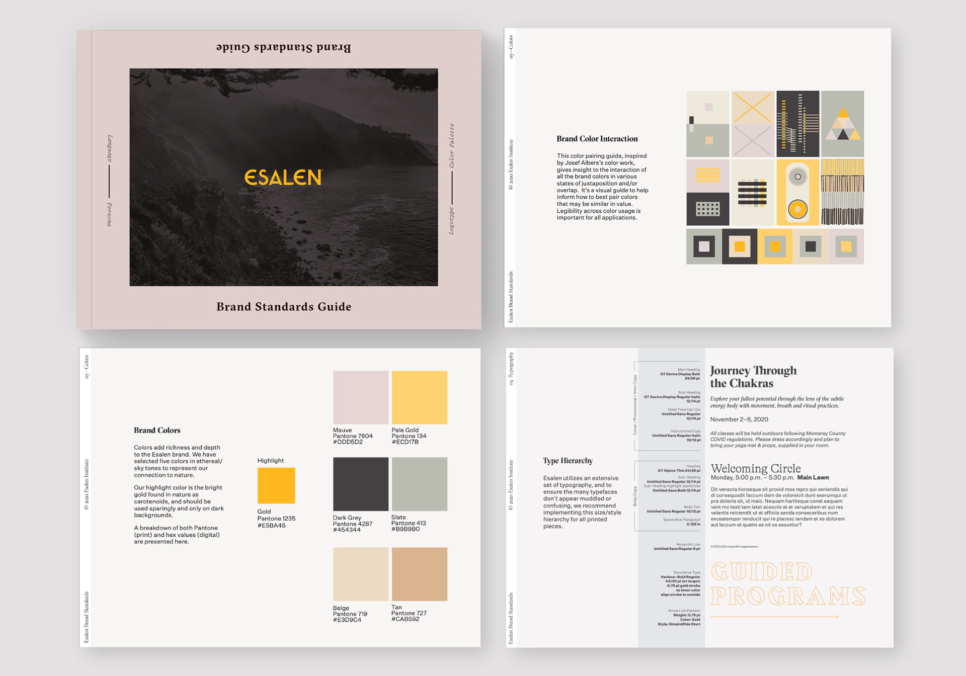
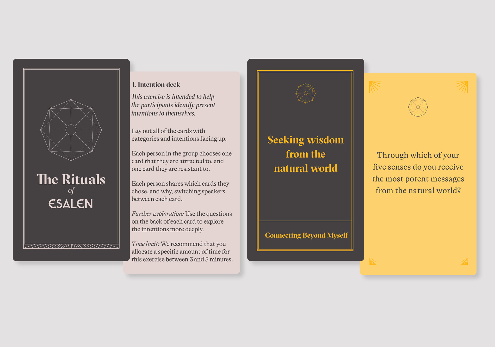
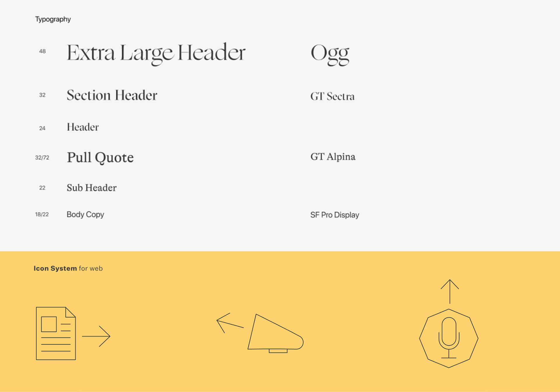
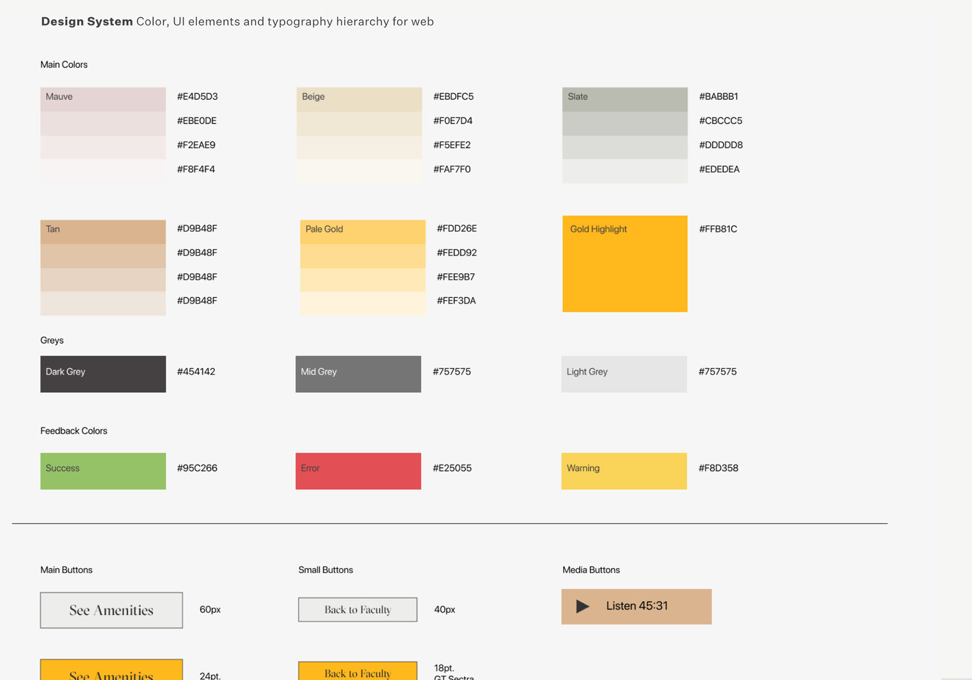
I developed a set of Brand Standards establishing key components such as brand colors, type hierarchy, logo usage, personas and language tone. These standards would set the stage for all print & digital creative and would provide the building blocks for the website redesign.
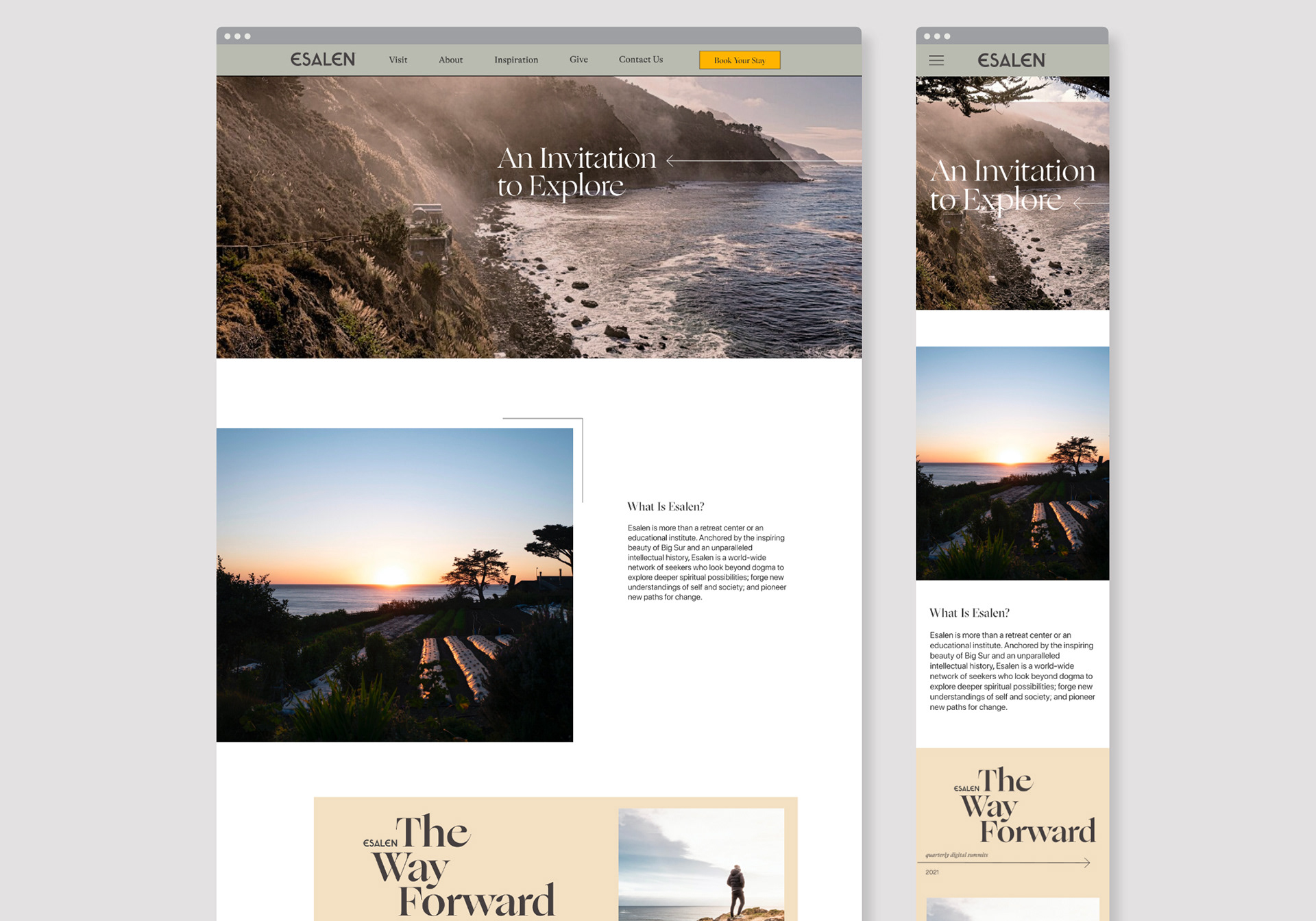
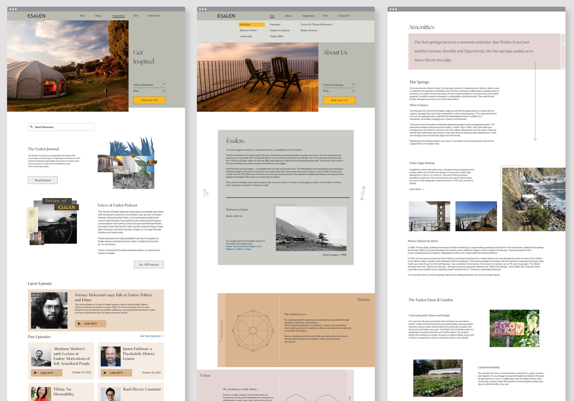
I led the design on the arduous task of redesigning the outdated Esalen website, with multiple CMS additions and deprecated pages. We breathed new life into their large photo archive and developed a formal design system. The website needed to be responsive and retain its unique feel on all mobile devices.
The goal was to make the UI function in a more open, carefree way. Let your mouse bounce around and explore different areas of the site. This way one could have more of a UI journey than regimented flows. It was a departure from the previous, text dense site and allowed for more exploration of the rich photography. In a way, it attempted to mimic how someone feels when exploring the beautiful grounds at the Esalen Institute.
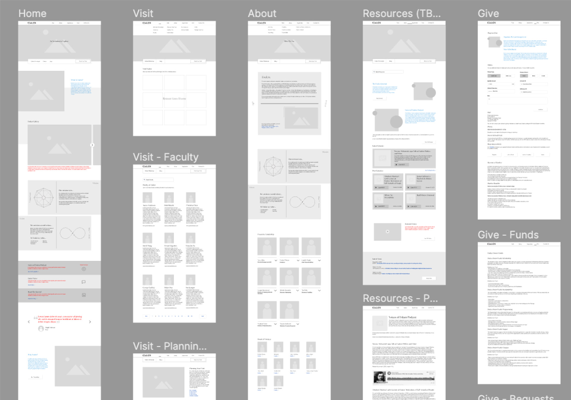
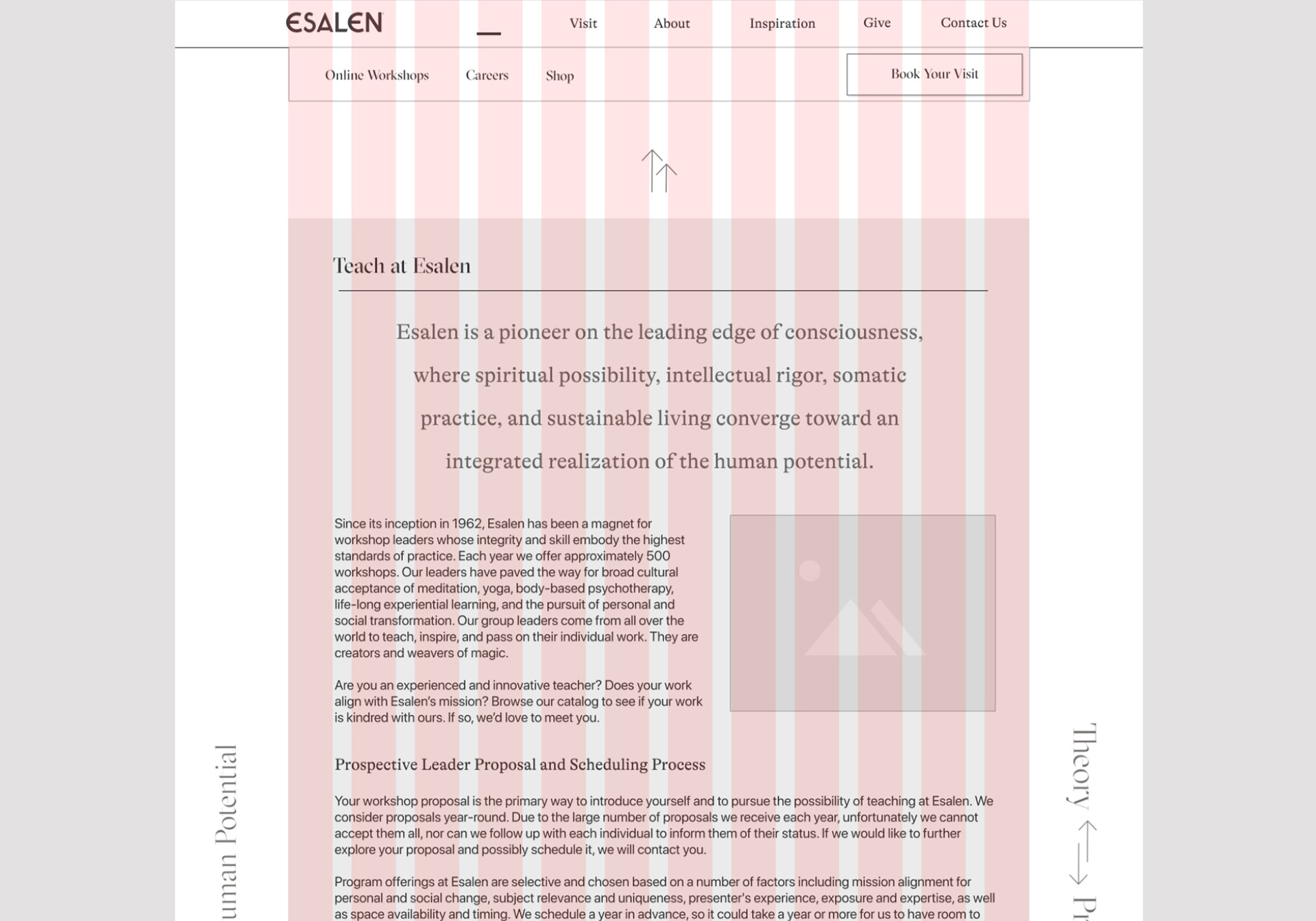
A vast set of wireframes was developed first based on the reorganized site map, developed by the team at 5Four Digital.
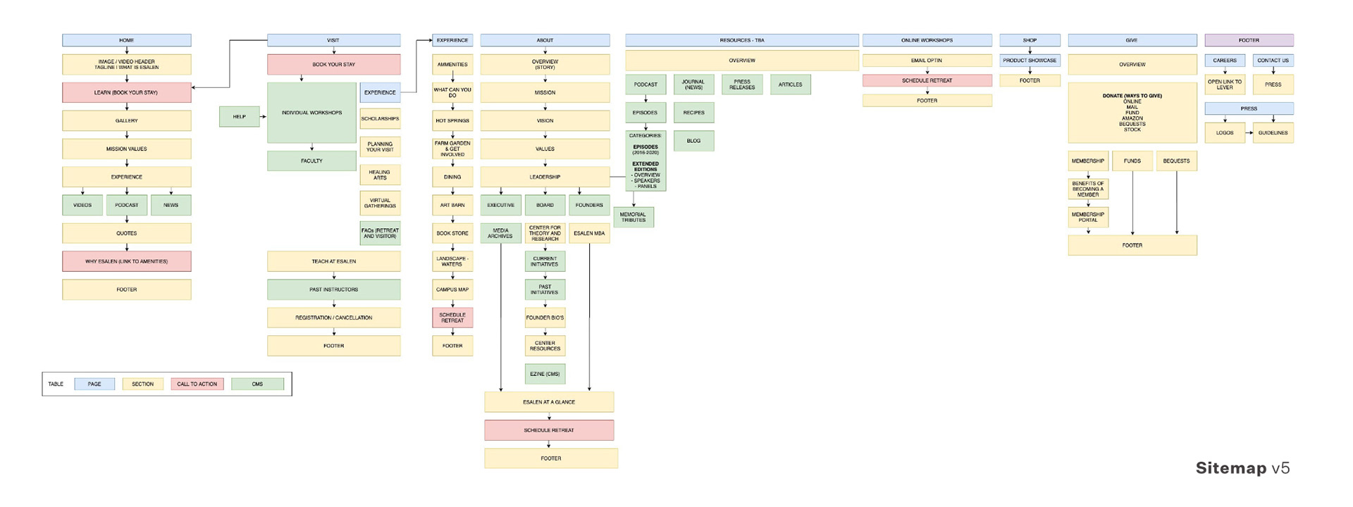
As the wireframes were established and the UI of the content was reorganized in a way that made sense to the team (and those visiting the site) I applied our brand standards and worked to develop a more filled-out visual style and turned them into a simplified design system, adding icons and UI colors.
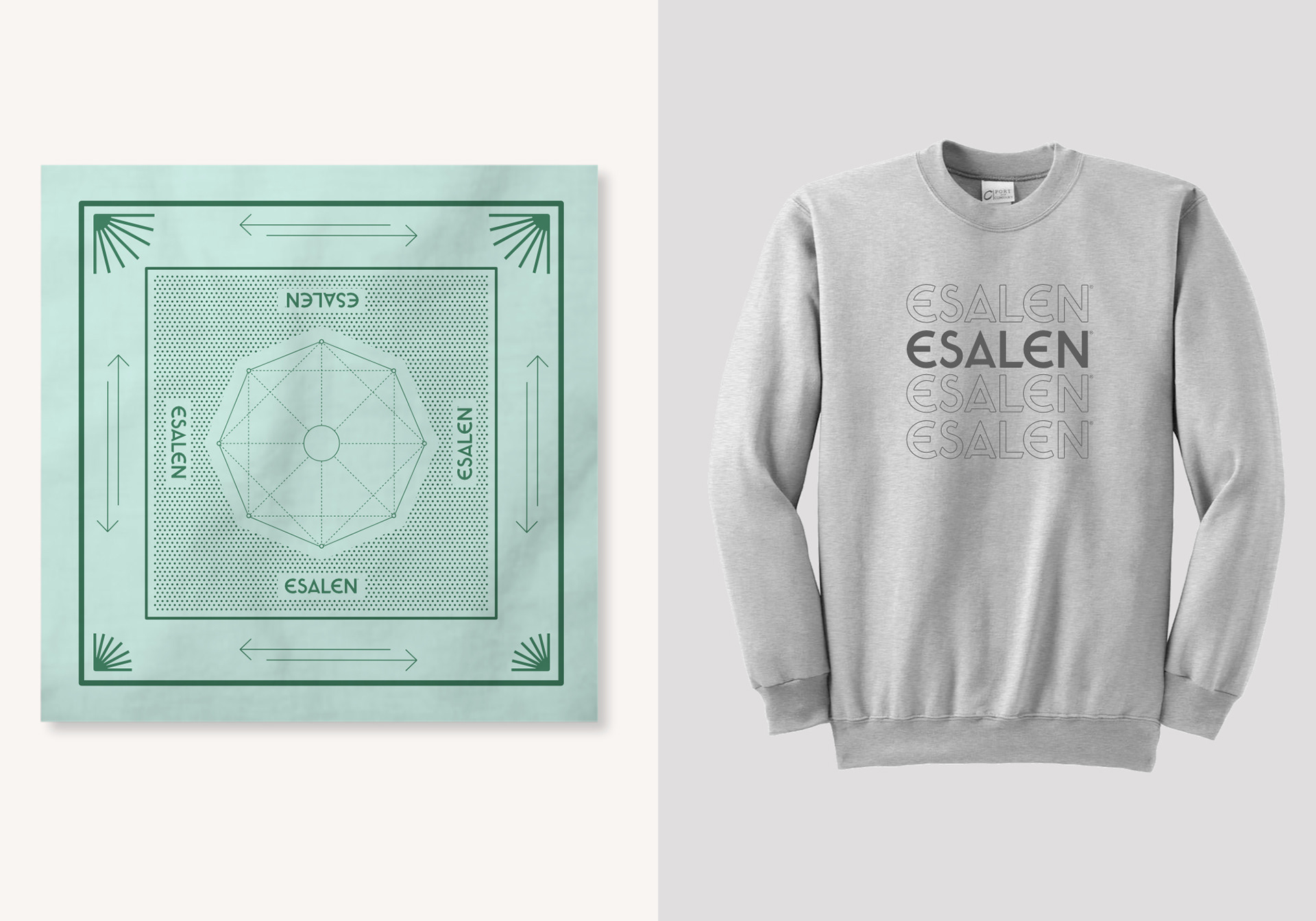
Along with updating the site, the rebrand encompassed a lot of the new collateral pieces being developed for Esalen's reopening. A handful of items like totebags, wearables, posters, and water bottles carried the updated graphics.