
Yelp, circa 2006
When Yelp started, there were only paid review sites like Citysearch, Judy's Book and Insider Pages that took an editorial/curated approach to user reviews. Yelp changed the game by giving everyone a voice on their local neighborhood spots and focused on a key group of people who wanted to be seen as tastemakers and influencers.
The Problem: Most review sites took a 'mile-wide, inch deep' approach, by hiring people across the country to write reviews of local businesses, in both small and large markets. Yelp approached several key major metro markets – San Francisco, New York, Chicago, Los Angeles and Seattle – to better understand the communities and grow them more organically. Community managers helped foster user behavior and set up a select group known as the Yelp Elite Squad to produce most of the content. As a reward, Yelp put on events with food and beverage sponsors that felt relatively exclusive. We built a social network from the ground up, with a focus on these key contributors to help evangelize their favorite local businesses.

I learned product design on the job at Yelp over 4.5 years and made a lot of bad design decisions as the only designer, but we tested, learned and refined to what Yelp is today. I designed over 1,000 mocks in Fireworks (sort of like Photoshop Lite product from Macromedia) from chicken scratch wireframe ideas and hundreds of whiteboard sessions. Because of time constraints I would often design in mostly high-fidelity, thinking this was the most efficient. Slowly I learned to brainstorm and form more ideas around a development process.
Digital Product
Consumer review site.
Background
Yelp began in 2004 when co- founder Jeremy Stoppelman was looking for a doctor and had little luck, and thus was the impetus behind the site. I was hired as lead designer in 2004 to design a rebrand as well as the UI of the entire site. I helped steer the product from a thousand page views to 25M unique views by the time I left in mid 2009. I returned as a product designer in 2012 to help update various aspects on the Consumer Product Team.
Role
Lead Designer / Creative Director
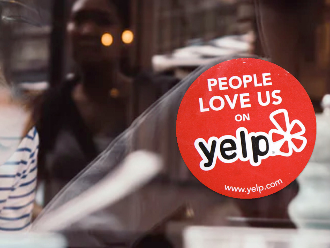
After a year I became a cross- functional Creative Director, handling design for product, marketing, sales and community. I helped design and strategize the People Love Us On Yelp campaign, strategized and developed the UI for various site features, designed ad campaigns and created a ton of promotional items for key markets across the country.
After a year I became a cross- functional Creative Director, handling design for product, marketing, sales and community. I helped design and strategize the People Love Us On Yelp campaign, strategized and developed the UI for various site features, designed ad campaigns and created a ton of promotional items for key markets across the country.
Initiatives
UI/UX development Brand Identity
User research/testing Product management Marketing design
User research/testing Product management Marketing design
Team
Jeremy Stoppelman, CEO
Nish Nadaraja, Marketing & Brand Director
Brad Porteus: VP of Marketing
Audrey Tsang, Product Manager
Nish Nadaraja, Marketing & Brand Director
Brad Porteus: VP of Marketing
Audrey Tsang, Product Manager

I was brought on as lead designer in 2004 to design a new type of review site that would help connect people with great local businesses. In early design sprints, I worked directly with Jeremy Stoppelman, Yelp’s CEO from napkin sketches to wireframes to hundreds of full visual mockups. As a scrappy startup, our methodology was still being developed.
Yelp Welcome Page
The Welcome Page was meant to be a portal into all that Yelp had to offer, with ideas around a proto-news feed, surfacing enticing content, encouraging people to write reviews and highlighting the best reviews from our Yelp Elite community. We designed this page to feel active, like a real community, and provide multiple entry points to various content on the site. Early on this page suffered from lack of focus, and every bit of content fighting for your attention. This became less of an issue as the largest entry point to Yelp was to the Biz Details page from Google.

Yelp Biz Details
Balancing utility with a pleasant user experience was never an easy one, especially with our Business Detail Pages crammed full of photos, hours, locations and reviews. Enhanced listings also became crucial to help sales sign on advertisers that wanted a more robust, feature-rich page to show to potential customers. Early integration with Google Maps would also set the stage for more advanced search functionality and added features like cross-streets and metro information.

Profile Page
Our user base was centered around 25-35 year olds with disposable income that saw themselves as tastemakers of their local market. Originally the profile page was touted as a ‘micro-blog’ platform and it was important to showcase their reviews, compliments and Elite status. These power users helped generate the bulk of our content and were instrumental in helping us spread the word about using Yelp.
Yelp Search and Maptastic
The Problem
Early at Yelp we had built an overwrought feature called Maptastic that no one used or could find while searching. The idea behind the page was just to utilize Google’s Map API to have a dynamic, searchable map with Yelp data on top.
After conducting preliminary user interviews, we found that people had two distinct modes associated with search: browse and direct keyword search. We wanted to figure out when they switched modes and whether or not we should have two distinct search pages for each mode. Our hypothesis said we should combine them.


Usability Tests
The solution: We conducted weeks of usability tests with random samples of users from Craigslist, both self-identified as frequent Yelp users as well as those unfamiliar with the site. We led them through a script and had them answer a series of questions about the way they searched for local businesses online. Very often the user would tell us that they wanted to switch between the two search modes (i.e. a user searching for a specific term ‘doctor’ may want to browse the neighborhood afterwards to and a lunch spot near the doctor’s office).

Yelp UI - Mo' Map
User testing helped us create a more flexible search page. Often the user was unsure which mode they wanted to be in, so we provided a seamless blending of the two with an easy UI to toggle back & forth.
In response we developed a search feature that had an expandable/collapsible map, dynamic filters that adjusted the results real-time, and less business information in browse mode. Our bounce rate on the search page decreased by 15-20% and anecdotally we had a lot of positive feedback as we scaled up 7M visitors a month to these pages.


Yelp App and Icons & Graphics
When I went back to work at Yelp in 2012, I took on the task of updating all of my original icons and illustrations on the site and within the Yelp App. Lots of tiny little details to sweat for retina display sizes and eventual conversion to SVG.
I also had a little fun on the app while I was there. The hamster wheel Easter Egg on the Settings page even got a little bit of play in the tech news.